From Athens to London: pedestrian collisions and the built environment, five years on
In 2021 I finished my master’s thesis in Geoinformatics at the National Technical University of Athens. It looked at 1,318 pedestrian collisions in the Municipality of Athens between 2008 and 2017 and asked a simple question: how does the shape of the city relate to where pedestrians are injured?
I found persistent hotspots in the centre, around Omonia, Syggrou and Vasilissis Sofias, and associations with bars and pubs, crossings, traffic signals and bus stops. The thesis ended, as theses do, with a list of things I wished I’d had: time of day, the age of the people involved, socio-economic context, a sense of how busy each place is.
Five years later, I asked the same questions of London. This time I had all of those things.
The data
London is a gift for this kind of work, because almost everything is open:
- Collisions: the Department for Transport’s STATS19 data. Every police-recorded injury collision, with location, date, time, severity and the age of each casualty.
- Neighbourhoods: ONS small-area boundaries, the English Indices of Deprivation 2025 and population figures.
- Streets: OpenStreetMap for crossings, signals, bus stops, stations, schools, pubs and the drivable street network.
From 2021 to 2025 there were 22,108 pedestrian casualties in Greater London. 5,926 of them were killed or seriously injured, and deaths ranged from 36 to 61 a year.
| Year | Killed | Seriously injured | Slightly injured | Total |
|---|---|---|---|---|
| 2021 | 36 | 926 | 2,878 | 3,840 |
| 2022 | 42 | 1,194 | 3,322 | 4,558 |
| 2023 | 53 | 1,223 | 3,279 | 4,555 |
| 2024 | 61 | 1,136 | 3,254 | 4,451 |
| 2025 | 51 | 1,204 | 3,449 | 4,704 |
The low 2021 figure is almost certainly the early-2021 lockdown keeping people off the streets, a reminder that counts always carry the conditions they were collected in.
Lesson one: the denominator changes the story
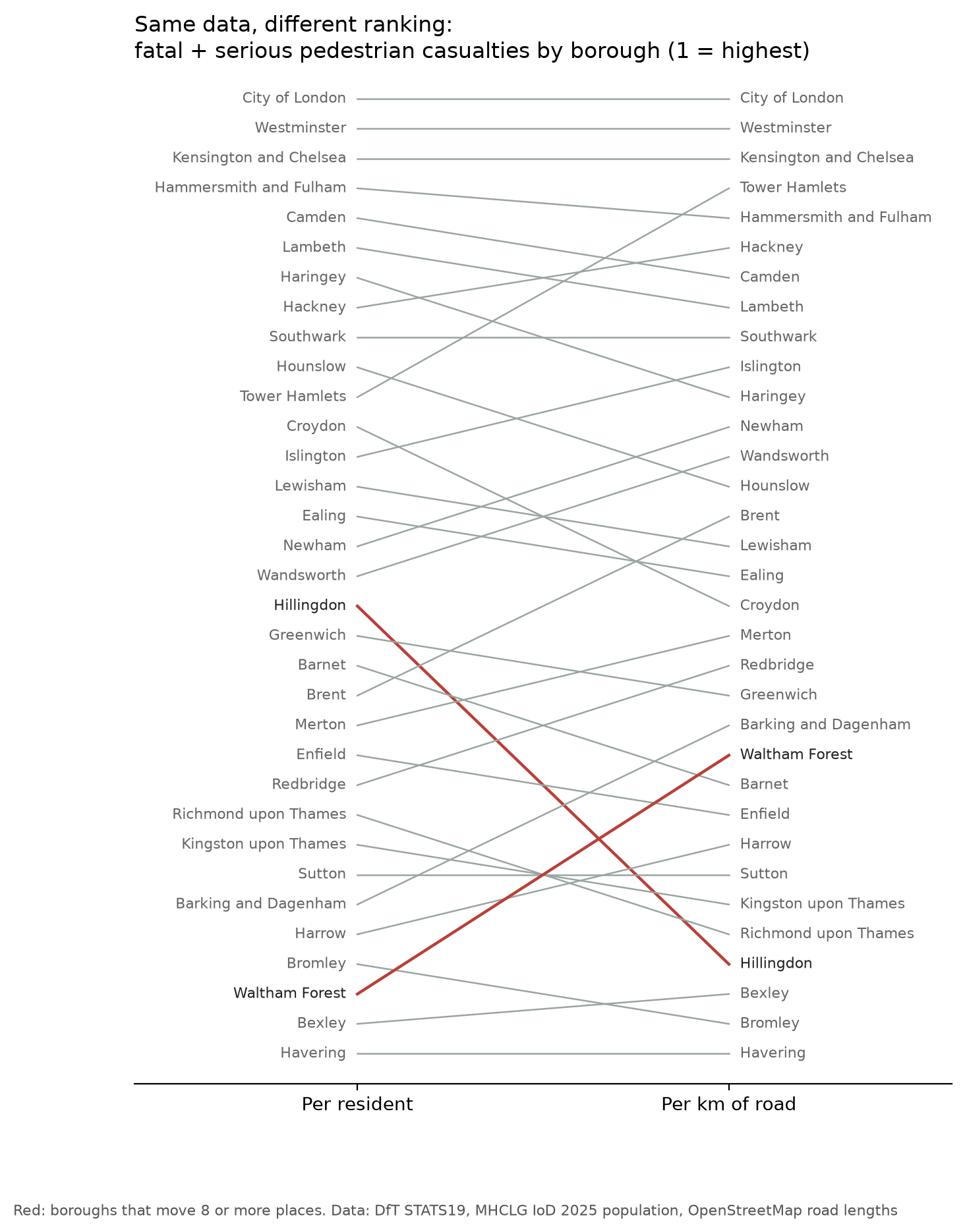
Ranked by fatal and serious casualties per 100,000 residents, the City of London comes out at 167.6 a year, nearly four times the next borough, Westminster (43.0). Taken at face value, it is by far the most dangerous place to walk in the capital.
It isn’t. Only a few thousand people live in the City, while hundreds of thousands work there or pass through every weekday. Dividing by residents measures something, but not the risk of walking there. Ranked per kilometre of road instead, the order changes substantially.
Lesson two: crossings “correlate” with casualties
Comparing London’s roughly 5,000 small areas, the features that rise most strongly with serious pedestrian casualties per km² were traffic signals and crossings (rank correlations of about +0.4), followed by major roads, bus stops, junctions and pubs and bars. Almost exactly what I found in Athens.
It would be easy, and wrong, to conclude that crossings are dangerous. Two things are going on:
- Exposure. Crossings, signals, bus stops and pubs are put where lots of people meet lots of traffic. Many of these variables partly measure “how busy is this place”.
- Reverse causality. Crossings and signals are often installed because a location had collisions. The safety measure follows the problem.
This is why the project goes on to fit a negative binomial model that accounts for how busy each area is, asking which street features still go with more casualties once activity is taken into account. That is the question my thesis couldn’t answer with the data it had.
Finding hotspots along streets, not across them
In Athens I used planar kernel density, the familiar heatmap. Its weakness in a city is that a cluster on one road “leaks” onto a parallel street across a block. For London I measured density along the street network instead: the streets are cut into 50 m pieces and each casualty’s weight spreads along the network for 250 m.
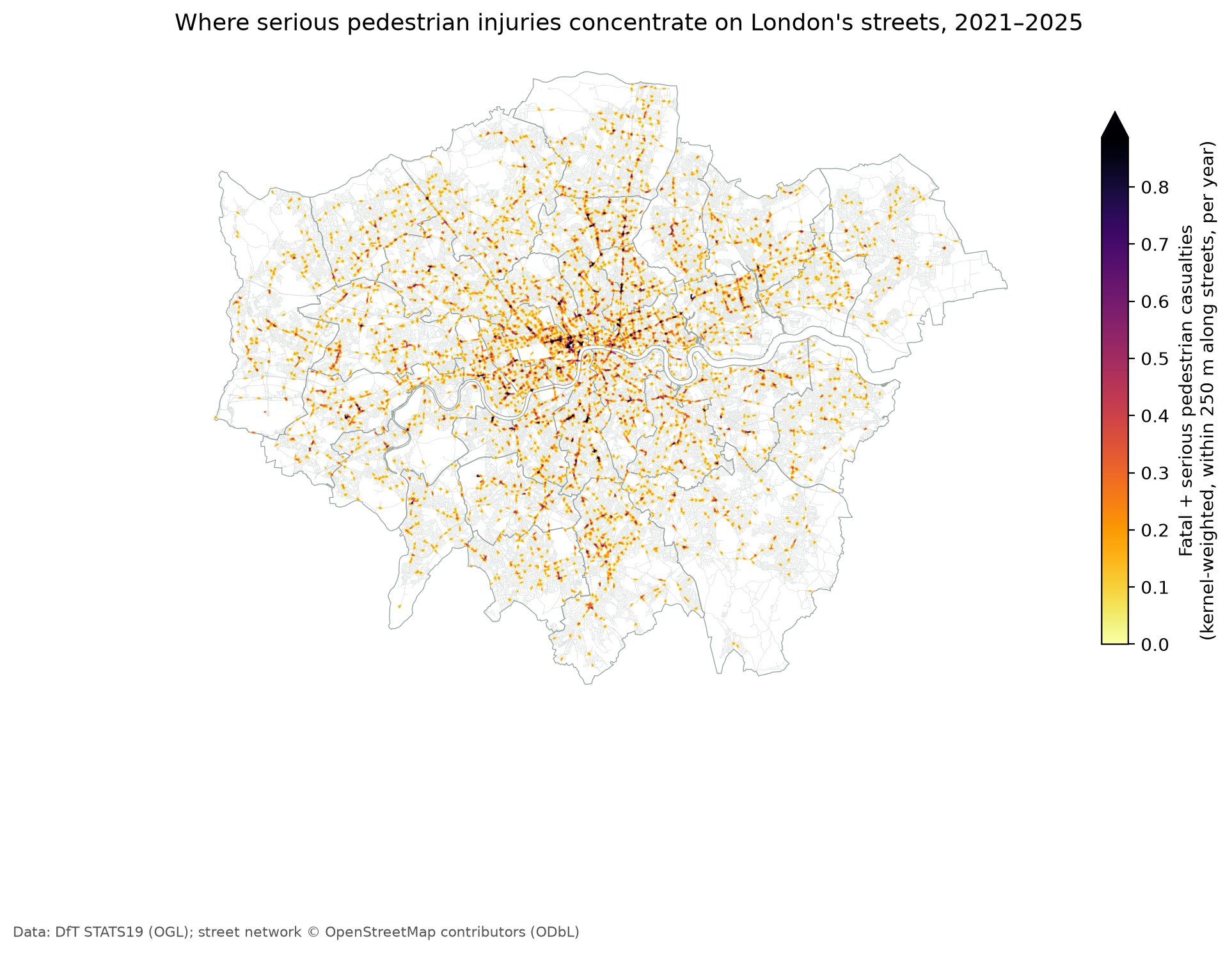
Alongside it, a Getis-Ord Gi* analysis on small areas separates statistically significant clusters from random noise, with a correction for testing thousands of areas at once.
How far is emergency care?
My Athens dashboard showed hospitals next to collisions. In London I went a step further and measured the drive time along the street network from every casualty to the nearest A&E and to the nearest of London’s four major trauma centres, where the most seriously injured are taken.
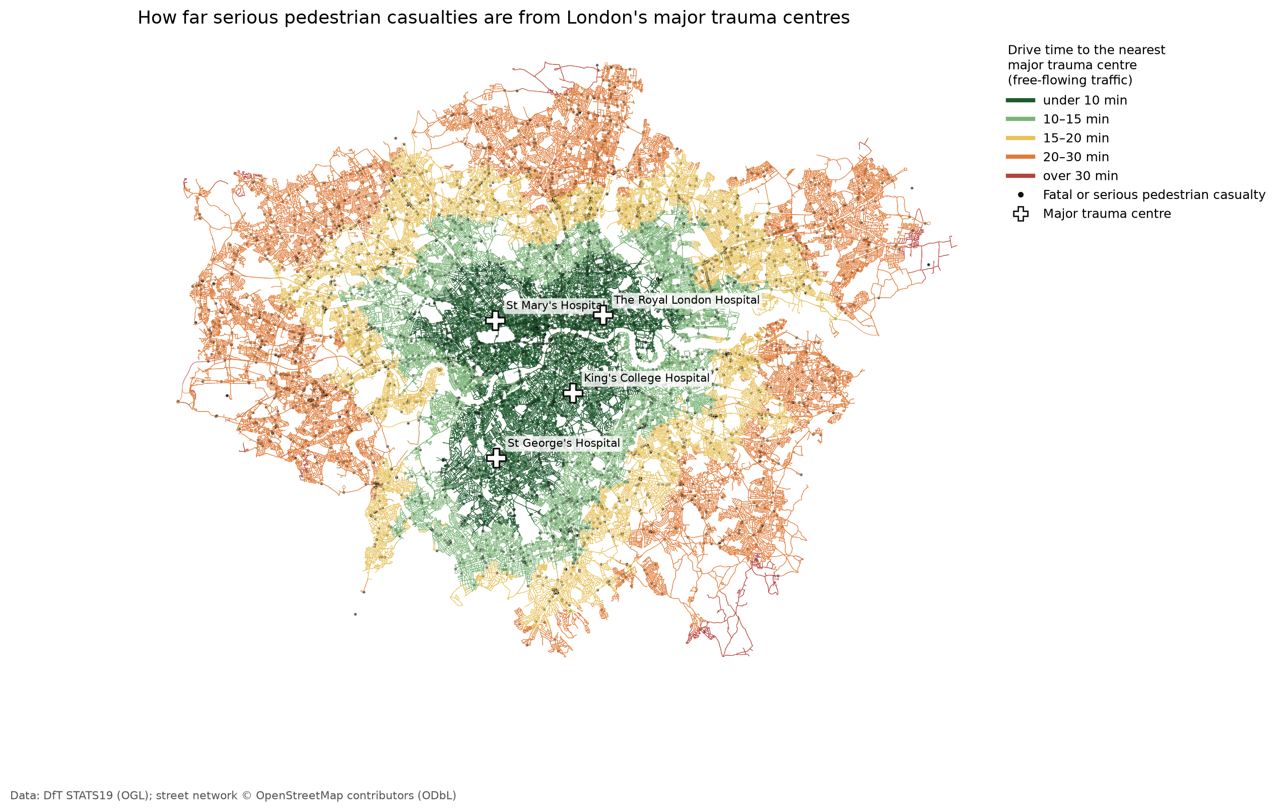
These are free-flowing times for the hospital journey, not ambulance response times, but they show clearly which parts of London are furthest from trauma care.
Then and now
In 2021 my tools were R and ArcGIS Pro, with Esri Dashboards and StoryMaps for the visuals, and the project took months.
This time I worked with an AI assistant, Claude, and went from research questions to a tested analysis pipeline and a live dashboard in a fraction of the time. The questions, the choice of methods and the judgement about what the results mean came from my research background. The AI made it possible to build and check everything much faster, including testing the model on synthetic data with known answers before trusting it on the real thing.
The whole project uses open data and open-source Python, and anyone can rerun it.
- Explore the dashboard: etymo.co.uk/london-pedestrian-safety. Try the spotlight on a junction you know, or play the years.
- Code and methods: github.com/eritrouib/london-pedestrian-safety
What’s next
Two things. First, publishing the Athens work properly, re-analysed with the methods developed here. Second, an AI layer for the London data, so anyone can ask a question in plain English and get an answer computed from the data, with its sources, rather than a guess.
Data: Department for Transport STATS19, ONS, MHCLG (Open Government Licence); OpenStreetMap contributors (ODbL). Police-recorded data under-reports minor pedestrian injuries, and associations between areas and casualties do not show cause.